Guide10 min read
18 LinkedIn Cover Photo Ideas to Complete Your Profile (2026 Guide)
Your LinkedIn banner is prime real estate most people waste. These 18 cover photo ideas work for every industry, with exact dimensions and free template sources.
Loading...
Your LinkedIn banner is prime real estate most people waste. These 18 cover photo ideas work for every industry, with exact dimensions and free template sources.
LensCherry Team
AI Photo Experts • Updated March 2026

Your LinkedIn banner is the biggest visual element on your profile. It's 4x wider than your profile photo and the first thing people see when they visit your page. And yet most people leave it as the default blue gradient or upload something random.
That's wasted real estate. A good cover photo reinforces who you are and what you do. Here are 18 ideas that actually work, organized by industry and role.
Before we dive in, the technical requirements:
That last point matters. LinkedIn crops the banner differently on desktop vs mobile. Anything critical should be centered.
The simplest option if your company provides one. Many organizations create LinkedIn banners with the company logo, tagline, and brand colors. It immediately signals where you work and creates visual consistency across the team.
If your company doesn't provide banners, suggest it to your marketing team. It's a quick win for employer branding.
A clean, high-quality photo of your city's skyline works for almost any business professional. It adds personality without being distracting. New York, San Francisco, London, Toronto. Any recognizable skyline conveys "I work in a major market."
Use a photo with good lighting. Sunrise and sunset shots look especially polished.
If you speak at events, a wide shot of you presenting to an audience is powerful social proof. It says "I'm an expert people pay to listen to." Even a photo from a small panel or workshop works.
Crop it to focus on you at the podium with the audience visible but not dominant.
© 2026 Vesperion Gate Inc. All rights reserved.
Built with ❤️ for creators everywhere
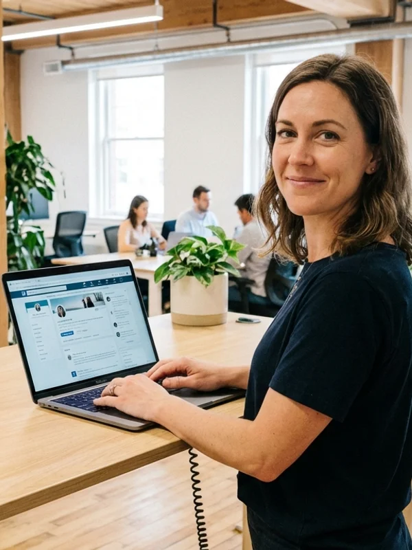
A wide shot of a modern, clean workspace. Can be your actual office or a generic professional setting. This works well for consultants, advisors, and corporate leaders.
Avoid messy desks or outdated offices. The goal is to convey professionalism and competence.
Arrange 3-5 of your best work samples in a banner-sized collage. For designers, photographers, illustrators, or architects, this turns your banner into a mini-portfolio that shows your capabilities at a glance.
Use consistent spacing and a clean background. Don't overcrowd it.
A photo of you working in your creative space. At the drafting table, behind the camera, in the recording studio. It adds authenticity and shows the human behind the work.
A clean abstract design using your personal brand colors. Gradients, geometric shapes, or textured backgrounds that match your portfolio's visual identity. Simple but distinctive.
A tasteful screenshot of your product's interface or a code editor with your work visible. For developers and product builders, this immediately signals what you do.
Blur any sensitive data. Use a dark theme for code editors. It tends to photograph better.
A natural, candid team photo showing collaboration. Works especially well for founders and leaders. It humanizes your profile and shows you build with people, not just code.
If you've built something people use, show it being used. A laptop or phone screen displaying your product in a real-world context. This works for SaaS founders, app developers, and product managers.
A clean graphic showing a key achievement. "Helped 500+ companies grow revenue" or "10,000 users and counting." Quantified results in your banner reinforce your credibility before anyone reads your summary.
Keep the design simple. One or two key numbers on a clean background.
With permission, display logos of companies you've worked with. This is social proof at its most direct. Arrange 6-10 recognizable logos on a clean background.
Your professional tagline or a short quote that captures your approach. "Making data-driven marketing accessible" or "I help B2B companies close faster." Keep it under 10 words.
Use clean typography on a solid or subtle gradient background.
A wide shot of your institution. University campus, hospital, research facility. It immediately contextualizes your role and adds credibility through association.
You teaching, researching, or mentoring. It shows passion for the work and adds a human element to what might otherwise be a formal profile.
A clean graphic listing your 3-4 core services. "Brand Strategy | Content Marketing | SEO | Analytics." This turns your banner into a quick-reference for what you offer.
A short client testimonial with their name and title. "Working with [you] transformed our marketing." Social proof directly in the banner catches attention.
For remote workers and digital nomads, a tasteful collage of locations where you've worked. It signals flexibility, global experience, and an interesting lifestyle.
A few tools for creating LinkedIn cover photos:
For headshots and profile photos to pair with your new banner, LensCherry generates professional options from selfies in about 30 seconds. Having a polished profile photo and banner together makes a much stronger impression than either one alone.
Text too small. If you include text, make it large enough to read on mobile. Test by viewing your profile on your phone.
Important content at the edges. LinkedIn crops banners differently across devices. Keep everything important in the center 60%.
Low resolution. A pixelated banner looks worse than the default one. Use images at least 1584 pixels wide.
Busy or cluttered designs. The banner sits behind your profile photo, name, and headline. Too much visual noise competes with your actual information.
Outdated content. If your banner mentions a job title you no longer hold or a company you've left, update it.
Your LinkedIn presence is the combination of three visual elements:
When all three are polished and consistent, your profile looks intentional and professional. And that matters more than most people realize. Recruiters spend an average of 6 seconds on a profile before deciding to dig deeper or move on. Make those seconds count.
Ready to complete the picture? Try LensCherry free and generate a professional headshot to pair with your new cover photo.
9 min read